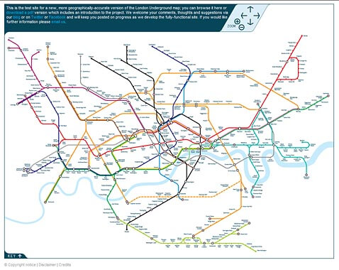
Up to 30% of travelers on the London Underground don't take the most efficient route on the Tube. To address this, there's a new tube map up at London-Tubemap and you should take a look at it if you either live in London, or are about to travel here. Below is a quick screenshot:

This new map more accurately reflects distances, which was not a feature of the currently used map, based on Harry Beck’s classic design. With the current sprawl of lines and stations, that map is now somewhat hard to use, and certainly don't help you orientate yourself back on the surface.
At the website, you can download a PDF version of the map, to print out.
I found it much easier to use this map, and it's instantly recognizable to anyone who's used the "official" Tube map. What do you think? Would you prefer to use this version?
You should follow me on twitter here.

Looks like a great resource and of course anything that can save time, money or both is always useful in my opinion.
Bluegreen Kirk on 07 July, 2011